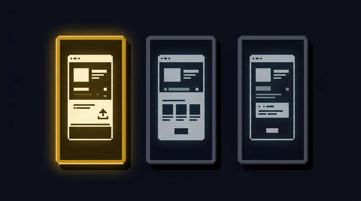
Keywords get you into the search results. The screenshot is what makes the person tap install. Most solo developers treat screenshots as decoration, captured last, exported from the simulator, uploaded. Then they watch the install rate and blame the keyword.
Screenshots are a conversion asset, not a formality. Apple gives you a way to test them that does not require a design team, and the workflow below shows how.
Why the screenshot is the close
On the App Store product page, you can feature up to 10 screenshots. The first one to three appear in search results when you have no app preview video. That first screenshot is often the only thing a searcher sees before deciding whether to tap your app or scroll to the next one.
So the first screenshot carries more conversion weight than the description, the icon, or the ratings in that initial moment. It is the close. A screenshot that shows the app doing the thing the person searched for, with a short caption naming the benefit, outperforms a screenshot that shows a loading screen or a generic settings panel. This is measurable, not opinion.
The mistake most indies make is treating all 10 screenshots as one set. They are not. The first three are the close. The remaining seven are the supporting case for someone who scrolled past the first three and is now deciding whether to read more. Different jobs, different content.
Build for the first three
Before you capture anything, write down one sentence for each of the first three screenshots. The sentence is the benefit the screenshot shows, not the feature it depicts.
The first screenshot answers "what is this app for." It shows the core action in progress, with a caption that names the outcome. If your app is a habit tracker, the first screenshot is the streak view with "keep a streak going" as the caption, not the empty onboarding screen.
The second screenshot answers "why this one." It shows the differentiator, with a caption that names what makes your app different from the obvious competitor. If your app is a minimal habit tracker, the second screenshot is the clean single-screen view with "no accounts, no clutter" as the caption.
The third screenshot answers "what else." It shows one secondary feature that rounds out the picture, with a caption that names the use case. This is where you earn the install from the person who was almost convinced by the first two.
If you cannot write the three sentences, you are not ready to capture. The capture is the easy part. Knowing what each screenshot is for is the work.
Capture, caption, crop
A few mechanics that separate a usable screenshot from a throwaway.
Capture on a real device, not the simulator, when you can. The simulator produces cleaner images but misses the rendering details that make a screenshot feel like the real app. Apple accepts simulator screenshots, and they are fine for early tests, but a real-device capture reads as more trustworthy at thumbnail size.
Add a caption overlay, not a paragraph. Five words, large, high contrast, top or bottom of the frame. The caption names the benefit from the sentence you wrote. Apple allows text overlays on screenshots, and they are the single biggest difference between a screenshot that communicates and one that just shows pixels. Keep the caption to one line. If you need two lines, the sentence is too long.
Crop to the device size the store requires for your target platforms. Apple has specific screenshot dimensions for each device family, and the wrong size either gets rejected or renders poorly at thumbnail. Check the current App Store Connect screenshot specifications before you export, because the required dimensions change when new devices ship.
The test Apple gives you for free
Here is the part most indies do not use. App Store Connect has product page optimization built in. You can create an alternate treatment with different screenshots, show it to a percentage of eligible users, and read the conversion result in App Analytics. You do not need a third-party tool.
The workflow:
- Capture your current screenshots as the baseline treatment.
- Build one alternate treatment that changes only the first three screenshots. Keep the icon, the description, and the rest the same. One variable.
- Set the alternate treatment to show to a percentage of traffic Apple recommends the default, and you can usually trust it.
- Let it run until App Analytics reports a statistically meaningful difference. The platform tells you when the result is significant, and you should wait for that signal instead of reading early noise.
- Apply the winning treatment as the default, then start the next test against a new alternate.
This is the same discipline as the ad-budget workflow: one variable, one measurable outcome, read the result when it is real. The difference is that Apple gives you the test infrastructure for screenshots without spending ad money.
What this workflow does not cover
It does not write your app name, subtitle, or description, which also carry weight in conversion. It does not fix a low rating, which suppresses conversion regardless of how good your screenshots are. It does not apply to Google Play, which has its own screenshot conventions and testing tools. The principles transfer, the mechanics do not.
Keywords get you into the results. Screenshots get you the install. If your install rate is low and your keyword rank is fine, the screenshot is the first place to look. If your keyword rank is the problem, no screenshot fixes that.
The checklist: write one benefit sentence per screenshot before you capture. The first three screenshots are the close; the remaining seven are the supporting case. Use App Store Connect's product page optimization to test one screenshot variable at a time. Apple gives you the test infrastructure for free.
For the full path from Expo app to both app stores, including the metadata and screenshot workflow, Mobile Development with Expo covers submission end to end.
Field reports
Log in to submit a field report.
Loading reports…